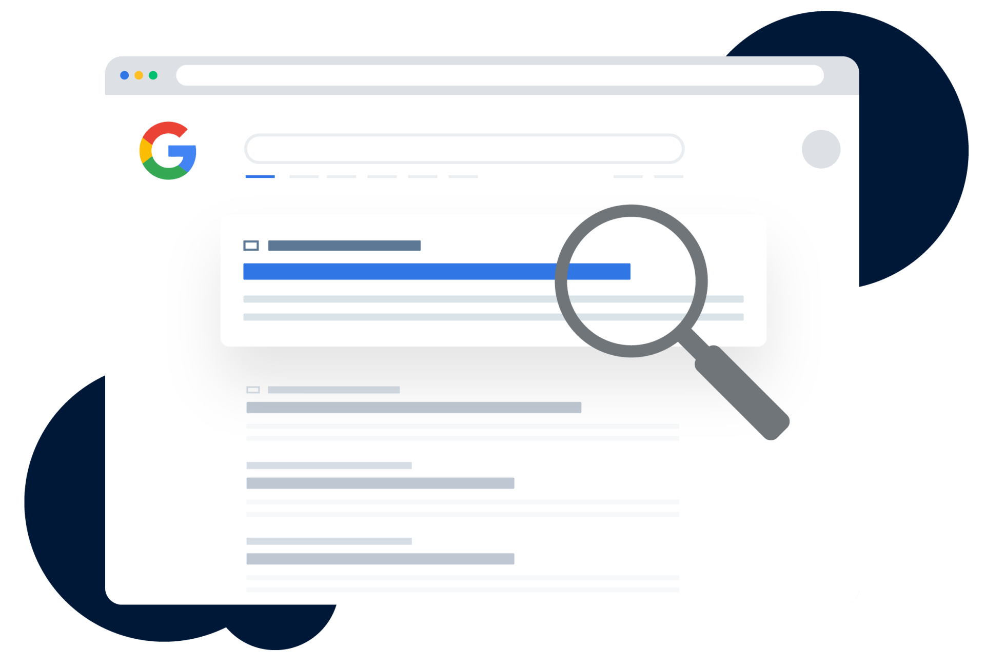
Google Has Transitioned to Mobile-Only Indexing: Should You Be Concerned?
Google has announced a shift to mobile-only indexing, meaning it will primarily use the mobile versions of websites for indexing and ranking, rather than the desktop versions.
Key points:
- From July 5, 2024, Google will exclusively use the Googlebot Smartphone crawler for indexing all websites. Previously, the search engine utilised both desktop and mobile crawlers for this purpose.
- If a website fails to render on phones or tablets, it will no longer appear in Google's search results. This will substantially reduce its search visibility, traffic, and user engagement.
- With the full transition to mobile-first indexing, Google is urging businesses to prioritise creating a mobile-friendly user experience.
What is Mobile-First Indexing?
Mobile-first indexing means that Google will primarily use the mobile version of a website's content for ranking and indexing purposes.
Google's mobile-first index initiative began in 2016, with its team gradually rolling out the change to more and more websites over the years. This move allowed Google Search to index content displayed to users on mobile websites, which was previously not possible, as Google primarily used the desktop version of a website for indexing purposes.
However, since July 5, 2024, all websites are now being indexed and ranked by Google based on their mobile version, making it crucial for businesses to have a responsive and user-friendly mobile website.
Why is Google Making This Change?
The Prevalence of Mobile Browsing
Consumers are now using their mobile devices more than desktops for internet browsing, making up approximately half of all web traffic worldwide. This shift in consumer behaviour has prompted Google to prioritise mobile-first indexing to accurately reflect user search patterns.
Google’s Focus on User Experience
Google's primary goal is to deliver the best search experience for its users. To do this, it must meet the demands of its users who are predominantly searching on mobile devices.
According to Statista, from January 2015 to February 2024, Google consistently captured over 93% of all search engine traffic worldwide. Considering the increasing popularity of mobile devices, it's not surprising that Google is making this change to ensure its search results are optimised for mobile users.
What Does This Mean for Businesses?
With the increasing shift toward mobile browsing, websites that are not mobile-friendly will inevitably face higher bounce rates and reduced visitor engagement due to subpar user experiences. Google is only reinforcing this fact by making mobile-friendliness a crucial factor in its search ranking algorithm.
Outdated websites and those that fail to render on mobile devices will be removed from Google search as part of Google's initiative to enhance overall user experience.
Consequently, even if a website performs well on desktop, its lack of responsiveness and user-friendliness on mobile devices can still lead to a significant decline in search engine visibility and traffic.
Is Desktop SEO Still Necessary?
Absolutely! RankingCo recognises the critical importance of a well-optimised website for both desktop and mobile devices.
We have been diligently working with our clients to ensure their sites are optimised for all devices. This way, no matter where their customers are accessing the sites from, they can enjoy a seamless user experience.
John Mueller from Google reinforces our stance that mobile-first indexing does not render desktop indexing obsolete. Rather, it emphasises the need for your website to be optimised for both desktop and mobile to perform and rank well on Google.
What Can Website Owners Do?
Thriving in the age of mobile-first indexing requires attention to detail and a proactive approach to website optimisation. Here are some best practices to help you get started:
Ensure Google's Accessibility to Your Content:
One of the keys to a responsive website is making sure Google can easily access and render your content. This can be achieved by allowing Googlebot access to CSS, JavaScript, and image files.
Accordingly, make sure Google can also crawl and index even your lazy-loaded content - which is content that loads only after a user interacts with it (either through swiping, scrolling, clicking)
Use Responsive Images:
Images are often the largest and most significant elements that slow down page loading, particularly on mobile devices. As such, optimising image sizes for mobile browsers will help reduce load time and improve user experience.
Using responsive images ensures that images adapt to the screen size and resolution of different devices, providing an optimal viewing experience while keeping page load times to a minimum. Use the srcset HTML image attribute to specify different image sizes for different screen resolutions.
Design for Fingers:
With Google strictly indexing and ranking sites based on their mobile version, prioritising user experience on mobile is paramount. Mobile devices are primarily operated by using fingers, and as such, responsive design should consider finger-friendly elements.
These elements include large buttons that are easy to tap, sufficient spacing between clickable items, and avoiding small fonts that can be challenging to read and click on small devices.
Consistency of Content Across Platforms:
This should be the golden rule for all website owners! No matter what devices a user is browsing from, they should be able to access and view all your site's information without any discrepancies or inconsistencies.
You don't want to confuse visitors with different content or layouts, let alone lose their attention and engagement due to an inconsistent user experience.
Test Regularly on Multiple Devices:
Testing your website on multiple devices with different screen sizes and resolutions ensures its responsiveness and user experience.
Don't assume that your mobile site is functioning optimally just because it looks good on your phone. Test it regularly for usability, load time, any crawl errors, broken links, and any other issues that may impact the user experience.
You can use tools like Google Lighthouse to evaluate your web pages for performance, accessibility, best practices, and SEO.
Monitoring and Reviewing Performance
Maintaining a fully optimised, mobile-friendly website is an ongoing process, requiring constant monitoring and regular reviews. Regularly use analytics tools like Google Analytics and Google Search Console to observe how their site performs on mobile devices.
Tracking key performance indicators (KPIs) such as load time, bounce rate, and page views can provide valuable insights into user behaviour and help identify areas to improve user experience.
Regular reviews and updates ensure that any issues are promptly addressed, keeping the website in line with the latest SEO best practices and technological advancements. To learn more about responsive design, check out this guide by Google.
Get Ranking with RankingCo
Work with a Google Premier Partner agency in the top 3% of all Google partners, worldwide!
Our expertise in all things SEO, combined with our experience in creating high-performing, responsive websites, makes us the ideal partner to help you navigate the world of mobile-first indexing and responsive website design.
Contact us today to learn more about how we can transform your website into a high-impact, responsive powerhouse!


Share online


