Optimising User Experience for Better Conversions: Expert UX Design Tips
Digital trends are evolving rapidly, making a slick, user-friendly website your ultimate ticket to success.
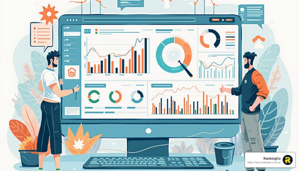
With 88% of online users ready to bounce after a poor experience and 94% of first impressions hinging on design, skimping on UX is simply not an option. The message is clear: top-notch design not only keeps users around but also ramps up your conversion rates.
In this blog, we’ll break down expert tips for levelling up your UX design, so you can turn visitors into repeat customers.
Prioritising Easy Navigation
If users can’t find what they’re looking for within a few clicks, they’ll likely jump ship.
Here’s how to keep them around:
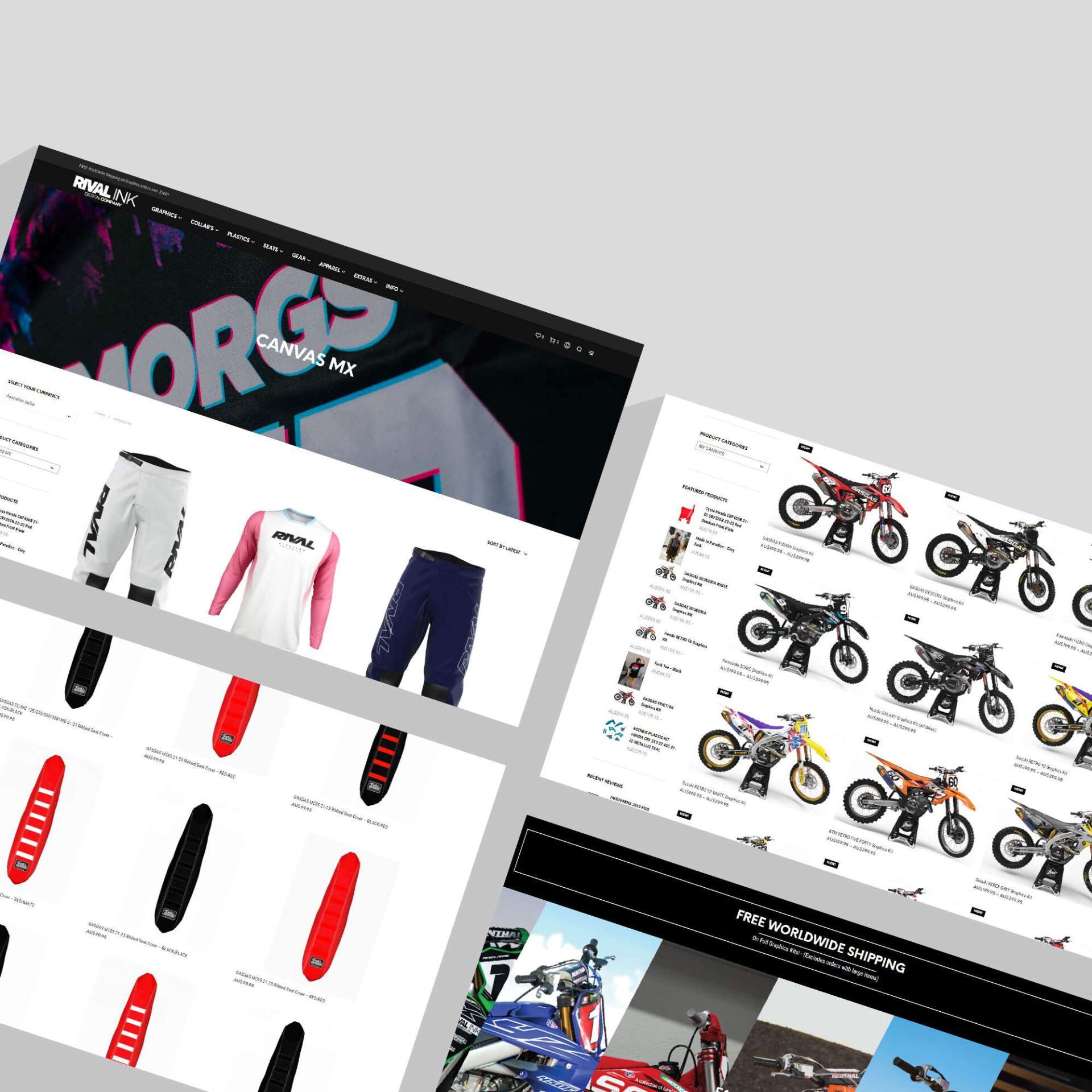
Simplify Your Menu
Keep your navigation menu straightforward and easy to understand. Limit the number of options to the essentials, and use clear, descriptive labels that guide users to the content they want.
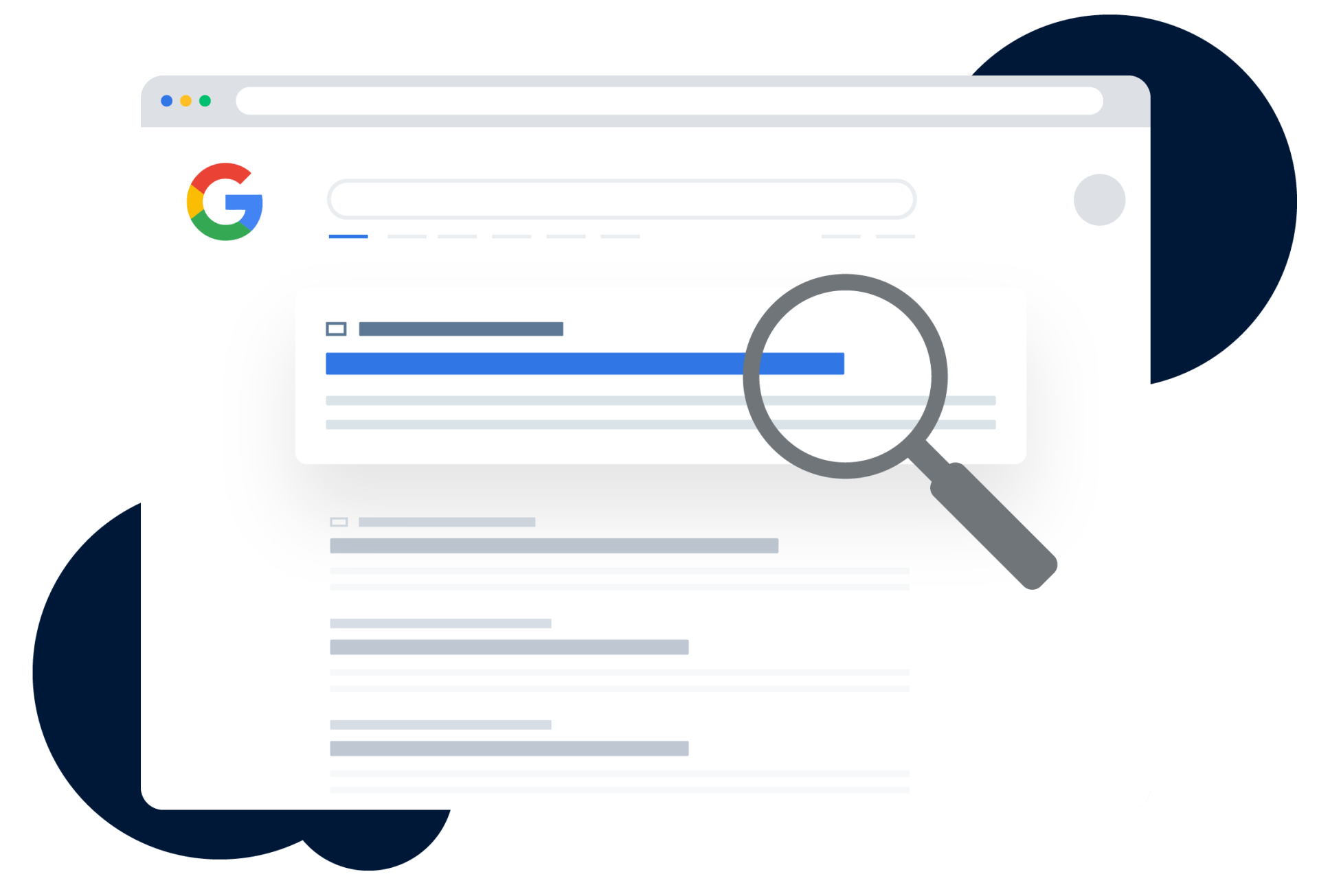
Use Breadcrumbs
Breadcrumbs are a navigational aid that helps users track their location within a website and understand the path they took to get there.
They're typically displayed as a horizontal list of links at the top of a page, usually right below the main navigation bar and might look something like this:
Home > Products > Electronics > Laptops > Gaming Laptops
Each part of the breadcrumb trail represents a different page or category the user has navigated through. By clicking on any of these links, users can easily backtrack to a previous page without having to rely on the browser's back button.
Internal Links
Smart internal linking keeps your site easy to navigate, encourages deeper engagement, and helps drive conversions. To make the most of them:
- Keep Visitors Exploring: Use links to guide users to related content, like taking them from a blog post straight to a product page.
- SEO Win: Internal links help search engines understand your site’s layout, which can improve your rankings.
- Seamless Integration: Add links naturally within your content with clear anchor text, like “discover our gaming laptops.” Refrain from using generic phrases like “click here” or “read more”—they don't tell users what to expect and miss the chance to add SEO value.
Enhancing Site Speed
Speed matters. In today’s digital world, users expect websites to load in the blink of an eye. If your site takes too long to load, visitors will quickly move on to a competitor.
Here’s how to keep your site running fast:
Optimise Images
Large, uncompressed images are one of the main culprits behind slow loading times. Use image compression tools to reduce file sizes without sacrificing quality.
Leverage Browser Caching
Caching stores parts of your site on a visitor’s device, so it loads faster on their next visit. This is particularly useful for returning users.
Minimise HTTP Requests
Each element on your page (images, scripts, stylesheets) requires an HTTP request to load. Reducing the number of elements on your page can significantly improve load times.
Designing for Mobile First
With more than half of all web traffic coming from mobile devices, having a mobile-friendly website isn’t optional—it’s essential! A responsive design ensures your site looks and functions well on screens of all sizes. Here’s how to nail mobile UX:
Responsive Layouts
Ensure your website adapts to different screen sizes seamlessly. Test on various devices to make sure the experience is consistent across the board.
Touch-Friendly Design
Make sure buttons and links are easy to tap without accidental clicks. Space out interactive elements and ensure they’re large enough for finger navigation.
Fast Mobile Load Times
Mobile users are even less patient with slow-loading sites. Implement all the speed optimisation tips mentioned earlier, but pay extra attention to mobile-specific performance.
Focusing on Visual Hierarchy
A well-thought-out visual hierarchy guides users’ eyes to the most important elements of your site. By strategically using size, colour, and spacing, you can direct users’ attention and encourage them to take action. Here’s how to create a strong visual hierarchy:
Contrast and Colour
Use contrasting colours to make calls to action (CTAs) stand out. A bright, bold button against a neutral background is hard to miss.
Whitespace is Your Friend
Don’t clutter your pages with too much information. Use whitespace to give your content room to breathe and make key elements stand out.
Consistent Fonts and Sizes
Stick to a consistent font style and size throughout your site. Headings should be larger and more prominent than body text to clearly signal importance.
Visual Content Attraction
Keep in mind that 9 out of 10 customers are more attracted to visual content rather than textual. Incorporate high-quality images, graphics, and videos to enhance engagement and make your site more appealing.
Make your site work harder for your brand.
Need a UX upgrade? Partner with RankingCo and turn your website into a conversion powerhouse.
Your journey to success starts now—reach out to our awesome team today at 1300 247 045 to see how we can elevate your digital presence and maximise your brand’s potential.


Share online